
In today’s digital world, mobile devices dominate internet usage. Optimizing your website for mobile is essential.
Mobile-friendly SEO techniques help improve your site’s performance on smartphones and tablets. These techniques ensure your website is accessible, user-friendly, and ranks higher in search results. With more people accessing the internet on their phones, having a mobile-friendly site can boost your visibility.
This blog will explore key techniques to make your website mobile-friendly. From responsive design to page speed optimization, we’ll cover the essentials. Whether you’re a beginner or an experienced webmaster, these tips will help enhance your site’s mobile experience. Stay tuned to learn how to make your site mobile-friendly and improve your SEO rankings.
Introduction To Mobile-friendly Seo
In today’s digital world, mobile devices dominate internet usage. More users now access websites via smartphones and tablets than desktops. Mobile-friendly SEO ensures your website performs well on these devices. It enhances user experience and boosts search rankings.
Importance Of Mobile Seo
Having a mobile-friendly website is crucial. Here’s why:
- Increased traffic: More people use mobile devices for browsing.
- Better user experience: Responsive design adapts to various screen sizes.
- Higher engagement: Users stay longer on mobile-friendly sites.
Impact On Search Rankings
Google and other search engines prioritize mobile-friendly websites. This affects your ranking. Here are the key factors:
- Mobile-first indexing: Google indexes mobile versions first.
- Page speed: Fast-loading sites rank higher.
- Usability: Easy navigation boosts rankings.
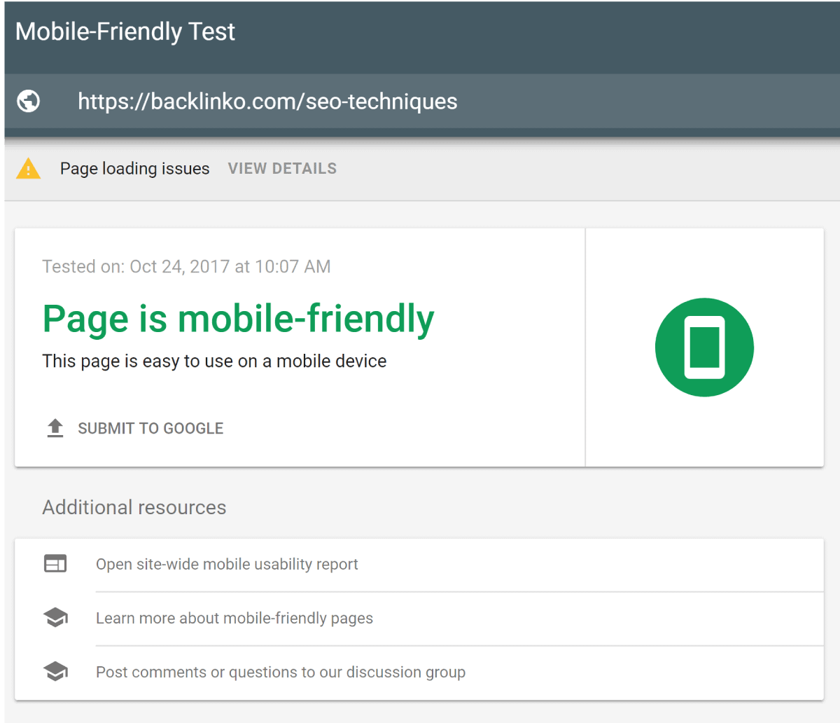
Credit: backlinko.com
Responsive Design Essentials
Ensuring your website is mobile-friendly is essential for SEO success. Responsive design is crucial. It adapts your website to fit any screen size. This enhances user experience and can boost your search engine rankings. Let’s explore some key aspects of responsive design.
Fluid Grids And Flexible Images
Fluid grids allow your website layout to resize based on screen size. They use relative units like percentages rather than fixed units like pixels. This ensures elements adjust smoothly.
Flexible images are also important. They resize within their containing element. This prevents images from breaking the layout on smaller screens. Use CSS to set images to a maximum width of 100%. This ensures they scale properly.
Media Queries For Different Devices
Media queries are powerful tools for responsive design. They apply different styles based on device characteristics. For example, screen width or resolution. Use them to adjust your layout for different devices.
Write media queries in your CSS file. Target specific screen sizes. For instance, you might set styles for devices with a max width of 600px. This ensures your site looks great on smartphones and tablets.
Improving Page Load Speed
Fast page load speed is vital for mobile SEO. A slow-loading page can frustrate users and increase bounce rates. By improving your page load speed, you can enhance user experience and boost your search rankings.
Optimizing Images And Videos
Images and videos can slow down your website. You can optimize them to load faster. Here are some tips:
- Use the right format: For images, use JPEG for photos and PNG for graphics. For videos, use MP4.
- Compress files: Use tools like TinyPNG or Compressor.io to reduce file sizes without losing quality.
- Lazy loading: Only load images and videos when they are visible on the screen. Use the
loading="lazy"attribute.
Properly optimized images and videos can significantly speed up your page load time.
Leveraging Browser Caching
Browser caching helps store some of your site’s data on the user’s device. This means the browser doesn’t have to download the data again on subsequent visits, which speeds up load times.
To enable browser caching, you can modify your .htaccess file. Here is an example code:
# Enable browser caching

  ExpiresActive On
  ExpiresByType image/jpg "access 1 year"
  ExpiresByType image/jpeg "access 1 year"
  ExpiresByType image/gif "access 1 year"
  ExpiresByType image/png "access 1 year"
  ExpiresByType text/css "access 1 month"
  ExpiresByType application/pdf "access 1 month"
  ExpiresByType text/javascript "access 1 month"
  ExpiresByType application/x-javascript "access 1 month"
  ExpiresByType application/javascript "access 1 month"
  ExpiresByType image/x-icon "access 1 year"
  ExpiresDefault "access 2 days"
Use browser caching to make your website faster for returning visitors.
Credit: www.slidegeeks.com
Mobile-first Indexing
Understanding Mobile-First Indexing is crucial for modern SEO. Google now uses the mobile version of your site for indexing and ranking. This change affects how websites appear in search results. Optimizing your site for mobile is no longer optional. It’s a must.
Google’s Mobile-first Approach
Google’s shift to a mobile-first approach means it prioritizes mobile-friendly websites. If your site isn’t optimized for mobile, it can hurt your rankings. Mobile-first indexing uses the mobile version of your site for ranking and indexing. Make sure your site is responsive and loads quickly on mobile devices.
| Desktop Indexing | Mobile-First Indexing |
|---|---|
| Google uses desktop site for indexing. | Google uses mobile site for indexing. |
| Mobile optimization was optional. | Mobile optimization is crucial. |
| Desktop page speed mattered more. | Mobile page speed is key. |
Optimizing Content For Mobile
Optimizing content for mobile involves several key strategies. Use short, concise sentences. Mobile users prefer quick reads. Break up text with headers and bullet points. This makes content easy to scan. Ensure images are optimized for fast loading. Slow images can drive users away.
- Responsive Design: Your site should adapt to different screen sizes.
- Fast Loading: Compress images and use efficient coding.
- Readable Fonts: Use fonts that are easy to read on small screens.
- Touch-Friendly: Make buttons and links easy to tap.
- Simplify Navigation: Use a clear and simple menu structure.
Here is a sample code for responsive design:
Adding this code ensures your site scales correctly on all devices. It’s a small but crucial step.
User Experience (ux) On Mobile
Ensuring a smooth User Experience (UX) on mobile is crucial for SEO. Mobile users expect fast loading times, intuitive navigation, and readable content. A pleasant UX can reduce bounce rates and improve search rankings. Here are some key techniques to enhance UX on mobile devices.
Simplifying Navigation
Simplified navigation helps users find what they need quickly. Use a clean, minimalistic menu. Avoid cluttering the screen with too many options. A clear, easy-to-use menu can improve user satisfaction. Consider using a hamburger menu for a cleaner look.
Ensuring Readable Text
Readable text is essential for mobile UX. Use a font size of at least 16px. Avoid overly decorative fonts. Ensure text contrasts well with the background. Short paragraphs and bullet points can make content easier to digest. Keep sentences short and straightforward.
Mobile-friendly Content
Creating content that is friendly for mobile devices is essential. Mobile users need easy-to-read and engaging content. This section will explore techniques to ensure your content is mobile-friendly.
Creating Scannable Content
Mobile users often scan content rather than read every word. To make your content scannable:
- Use clear headings and subheadings.
- Break up text with images or videos.
- Highlight key points with bold text.
Using Short Paragraphs And Bullet Points
Short paragraphs are easier to read on small screens. Aim for 2-3 sentences per paragraph. Bullet points help in breaking information into digestible chunks.
Here’s how to use bullet points effectively:
- List key features or benefits.
- Summarize important information.
- Make it easy to scan and understand.
Mobile-friendly Content Checklist
| Technique | Description |
|---|---|
| Headings | Use clear, concise headings to guide readers. |
| Short Paragraphs | Keep paragraphs short for better readability. |
| Bullet Points | Break down information into bullet points. |
| Bold Text | Highlight important points with bold text. |
Voice Search Optimization
Voice search is changing the way people find information online. Optimizing for voice search can help improve your mobile SEO. Here, we will explore some key techniques to enhance your website for voice search.
Incorporating Long-tail Keywords
Long-tail keywords are phrases that are more specific and longer than common keywords. They help capture user intent more accurately. To optimize for voice search, consider using these keywords.
- Think about how people speak naturally. Use conversational phrases.
- Include phrases like “how to” or “best way to” in your content.
- Analyze search queries to find common long-tail keywords.
Here’s a table to help understand the difference between traditional and long-tail keywords:
| Traditional Keyword | Long-Tail Keyword |
|---|---|
| SEO tips | How to improve SEO for mobile sites |
| Voice search | Tips for optimizing voice search in 2023 |
Answering Common Questions
When people use voice search, they often ask questions. Answering these questions can improve your chances of being found. Structure your content to address common queries.
- Identify frequently asked questions in your industry.
- Use tools like AnswerThePublic to find common questions.
- Create content that provides clear and concise answers.
For example, if you run a travel blog, you might answer questions like:
- “What are the best places to visit in Europe?”
- “How to travel on a budget?”
By addressing these questions directly, you improve your chances of appearing in voice search results.
Local Seo For Mobile Users
Mobile users often search for local businesses on their devices. Therefore, it’s essential to optimize your website for local SEO. This ensures that your business appears in local search results, making it easier for potential customers to find you. Let’s explore some key techniques.
Optimizing Google My Business
One of the most effective ways to improve your local SEO is by optimizing your Google My Business (GMB) profile. Here are some steps to follow:
- Claim and verify your GMB listing to gain control over your business information.
- Ensure your business name, address, and phone number (NAP) are accurate and consistent.
- Choose the right categories that best describe your business.
- Add high-quality images of your business, products, and services.
- Regularly update your GMB profile with new posts, offers, and events.
Encouraging Customer Reviews
Customer reviews play a significant role in local SEO. Positive reviews can boost your ranking and attract more customers. Here are some tips to encourage customer reviews:
- Ask satisfied customers to leave a review on your GMB profile.
- Make it easy for customers to leave reviews by providing direct links.
- Respond to reviews, both positive and negative, to show you value customer feedback.
- Offer exceptional service to encourage organic positive reviews.
- Highlight positive reviews on your website and social media channels.
By optimizing your Google My Business profile and encouraging customer reviews, you can enhance your local SEO and attract more mobile users to your business. These techniques help improve your visibility in local search results, making it easier for potential customers to find you.
Tracking Mobile Performance
Tracking mobile performance is crucial for any SEO strategy. Understanding how users interact with your site on mobile devices helps you make necessary adjustments. This ensures a seamless mobile experience, leading to better engagement and higher conversions. Let’s explore some effective methods to track mobile performance.
Using Google Analytics
Google Analytics is a powerful tool for tracking mobile performance. It offers insights into mobile user behavior and engagement. Set up separate views for mobile traffic to see how it differs from desktop traffic. This helps you identify specific areas needing improvement.
Use the Mobile Overview report to get a snapshot of mobile user activity. Check metrics like bounce rate, session duration, and pages per session. This data shows how effectively your mobile site retains visitors. Tailor your content and design based on these insights for better user experience.
Monitoring Mobile Traffic And Conversions
Monitoring mobile traffic and conversions is essential for evaluating your mobile SEO efforts. Use Google Analytics to track the number of mobile visitors. Compare it with desktop traffic to see the trend. This helps you understand the reach of your mobile site.
Track mobile conversions to measure the effectiveness of your mobile strategies. Set up goals in Google Analytics to monitor actions like form submissions, purchases, or sign-ups. Analyze the conversion rate for mobile users. Identify any drop-offs in the conversion funnel and address them promptly.
Regularly review your mobile performance data. Make informed decisions to enhance user experience and achieve better SEO results.

Credit: twitter.com
Future Trends In Mobile Seo
As mobile usage continues to grow, keeping up with mobile SEO trends is crucial. Understanding future trends can help you stay ahead in the competitive digital landscape. Let’s explore some key trends shaping the future of mobile SEO.
Ai And Machine Learning Impact
AI and machine learning will play a significant role in mobile SEO. Search engines will use advanced algorithms to deliver more accurate results. AI can analyze user behavior and preferences. It will help provide personalized content. Machine learning can predict user intent better. This means content must be more relevant and valuable. Optimize for voice search as it gains popularity. AI-powered assistants will become more common. Ensure your content is easily understandable by these systems.
Evolving Mobile Search Algorithms
Mobile search algorithms are constantly evolving. Google updates its algorithms frequently. These updates aim to improve user experience. Mobile-first indexing is a significant change. Google now prioritizes mobile versions of websites. Ensure your site is mobile-friendly. Page speed is another critical factor. Faster loading sites rank higher. AMP (Accelerated Mobile Pages) can help. Focus on creating high-quality content. Keep your site easy to navigate on mobile devices. Structured data can enhance search results. It helps search engines understand your content better.
Frequently Asked Questions
What Is Mobile-friendly Seo?
Mobile-friendly SEO ensures your website performs well on mobile devices. It includes responsive design, fast load times, and easy navigation.
Why Is Mobile Seo Important?
Mobile SEO is crucial because most users browse on mobile. It improves user experience and boosts your search engine rankings.
How To Check If My Site Is Mobile-friendly?
Use Google’s Mobile-Friendly Test tool. It analyzes your site’s mobile performance and provides suggestions for improvement.
What Are Key Mobile Seo Techniques?
Key techniques include responsive design, optimizing images, using AMP, and improving page load speed.
Conclusion
Optimizing your site for mobile is crucial today. Simple changes can boost visibility. Focus on responsive design and fast load times. Test your site regularly on mobile devices. Use clear and concise content. Avoid large images and complex layouts. Prioritize user experience above all.
Consistent updates and monitoring keep your site in top shape. By following these techniques, you ensure a better mobile experience. This will help drive more traffic and engagement. So, start implementing these tips now. Your audience will thank you.